Remitly

OVERVIEW
Personal project: Solutions for enhancing the Remitly App remittance experience for its 2 main customer segments.
Team: Ena Tioseco, Case Study, July 2020
background
Remitly is an online and mobile payment service company which provides international money transfers from the US. It is a fast, safe and affordable way to send money overseas. Their mission is
to tirelessly deliver on our promise to immigrants sending money across the world.
the QUESTION
How can Remitly better serve its customers aside from having the lowest rate and offering promos?

source: remitly.com
What we know:
Based on market research, customers remittance activity is based on 2 factors


Commitments
Time Sensitive Behaviors
User is not necessarily price conscious. They more or less have a scheduled day to send or at times, need to send right away.
Exchange Rates
Price Conscious Behaviors
User regularly checks rates, compares with other services and waits for a good rate they are comfortable with to send money
Solution
To serve both segments, the app should be able to check in with the user based on their behaviors. We can start with user driven personalization where the user would select options that match their remittance activity. The app then takes it from there and notifies the user when the rates are lowest or when a commitment is scheduled.
Price Conscious
Send notifications to let users know when price falls within a preferred range with an easy to send UI that does not require a lot of steps
Time Sensitive
Set a schedule for users to send money send push notifications on scheduled time an an easy go CTA to approve transaction
The notification should have a quick access button to see /edit the amount and approve the transaction.
WIREFRAMES & UI

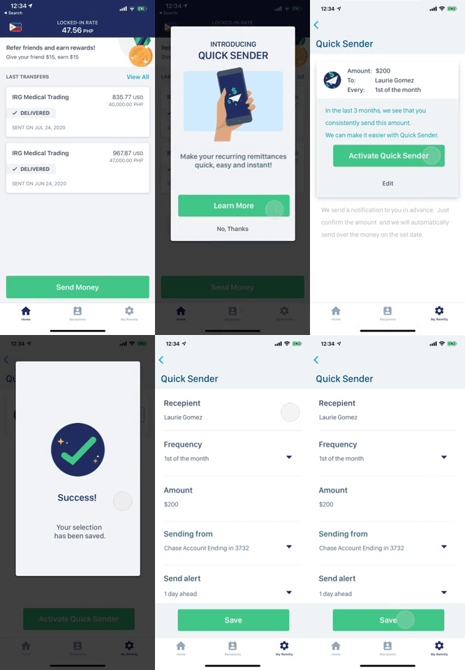
My initial wire was very simple. My first version of the Quick Sender had a pre-filled form that can be editable. The second version contained all the gathered information based on the user’s activity and provided an edit button. This would be great to A/B test.

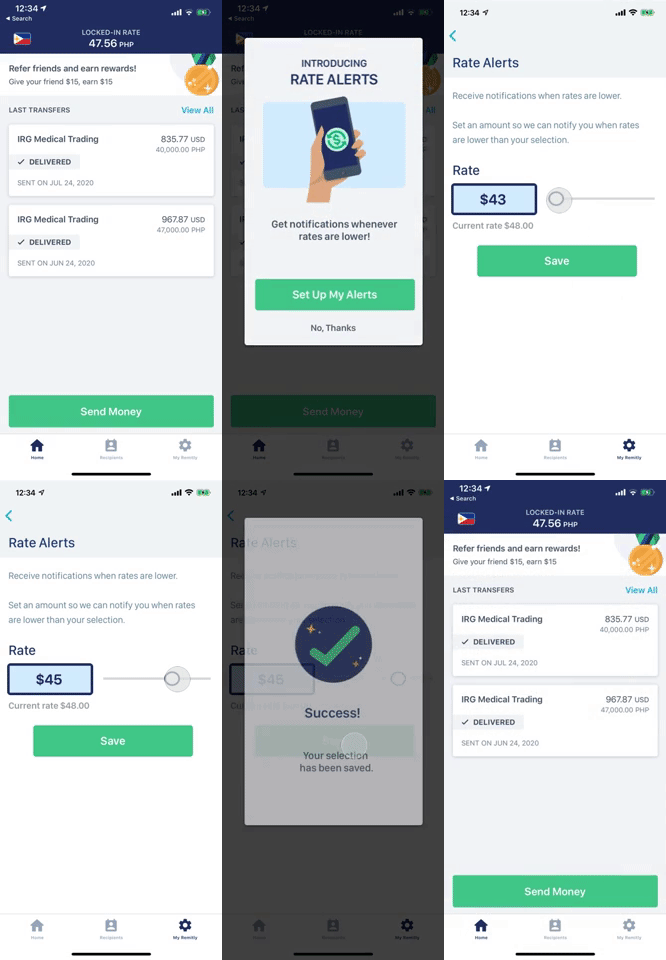
Here’s how the flow goes from the home screen, a contextual pop up appears showing them either Rate Alert for the price conscious users or Quick Sender for the Time Sensitive users.

For Rate Alert, it was simple and straight forward with just setting up the rate with a slider and text field.


With Quick Sender, I had to make a list of the Quick Sender Recipients for the feature.


Here are the prototypes

Rate Alert

Quick Send
FEEDBACK
Got some feedback after reaching out to Product Marketing at Remitly.
For Rate Alert, they are already testing something similar. Instead of the actual conversion rate, user is to set a % fee rate in order to be alerted. Similarly they will be using a modal to introduce the feature and it will also be tucked in to the “My Remitly” section.
For Quick Sender, Setup A was a winner in using a filled out form that minimizes text yet gives enough context. User will be able to edit the amount right there before activating. Product Marketing head said she would give this a go signal on their end for a feature.
Thats great validation. Would be nice to see if they do run with some version of it and see the numbers.
